
Capkin – Platformer Pack
Why My Asset Pack Was Getting Zero Views (And How I Fixed It)
How I fixed the thumbnail!
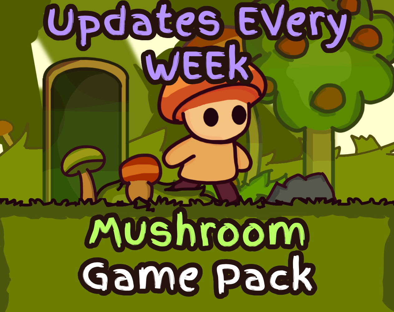
I just redesigned the thumbnail for my asset pack because… well, the old one wasn’t really doing its job. I noticed the views were super low, and I realized people weren’t even clicking because it wasn’t clear what the pack actually is. So I spent some time making a thumbnail that’s way easier to read at a glance and actually shows off what you get inside.
Honestly, thumbnails are crazy underrated. You could have the coolest asset pack ever, but if no one stops to look at it, it’s like it doesn’t even exist. I tried to make this one pop a bit more and give a quick idea of what’s in the pack without being too cluttered or over the top.
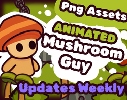
This was The Old Thumbnail
I’m curious to see if this actually helps the views go up, because it’s wild how much of a difference a simple image can make. Small things like this really matter when you’re trying to get noticed online.
Anyway, if you’ve ever struggled with making your stuff stand out, I feel you ,this is me experimenting and learning in real-time. Hoping this new thumbnail does its job and gets more people checking out the pack!
Main changes:
-
Removed unnecessary commas and extra spaces.
-
Added bold headings to make it easier to scan.
-
Smoothed one or two sentences for readability.
Leave a comment
Log in with itch.io to leave a comment.